What can I use Recent Train Times for?
This page provides a fast picture-based overview of Recent Train Times.
See the Help page for a more in-depth version.
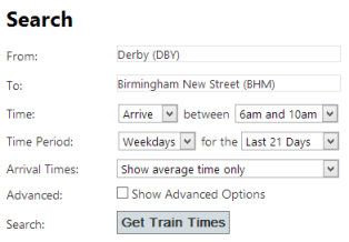
Searching for Train Times
Imagine you need to travel from Derby to Birmingham on a weekday morning.
Which train is the most punctual?
Do the trains on my route typically run on time?
How much time do I need to leave to make sure I get to my destination (work, meeting, etc) on time?
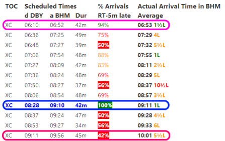
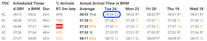
E.g. the first line in the table above, circled in pink: 06:10 departure from Derby, arriving Birmingham 06:52, arrived five or less minutes late 94% of the time, with an average delay of 1.5 minutes.
Best performer (by this statistic): 09:10 arrival, circled in blue. Worst performer: 09:56 arrival, circled in red.
The arrival statistic (% Arrivals Right Time up to 5 Minutes Late) can be changed using the Advanced Options.
Show me some actual recent arrival times
Choose the quick option "Show Actual Arrival Times" or change the Arrival Times setting to "Show average and actual times":
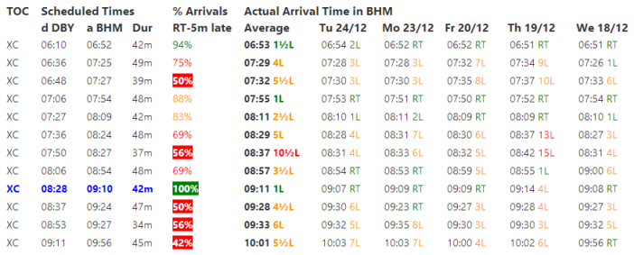
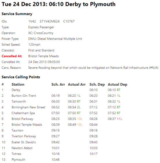
Show me the details of a particular service
Click on the arrival time of the service of interest, e.g. the 06:54 arrival on the 24th Dec:
Show me a chart illustrating the % of trains delayed and the lengths of those delays
Choose the quick option "Change Statistic: Cht" or change the Arrival Statistic setting to "All Statistics (colour chart)":
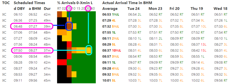
The dark blue circle covers an area shaded brown. This shows that the 06:48 from Derby arrived within five minutes only between 50 and 60 percent of the time.
The light blue circle covers an area shaded yellow. This shows that the 07:50 from Derby arrived within thirty minutes between 80 and 90 percent of the time.
Is performance consistently as good (or bad) everyday?
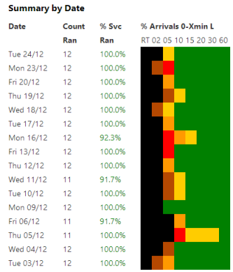
Show me a summary of performance by day
Choose the "Show a Daily Summary" option:
What is the likely worst experience travelling by different services?
Choose the "Show Likely Worst Experience" option:
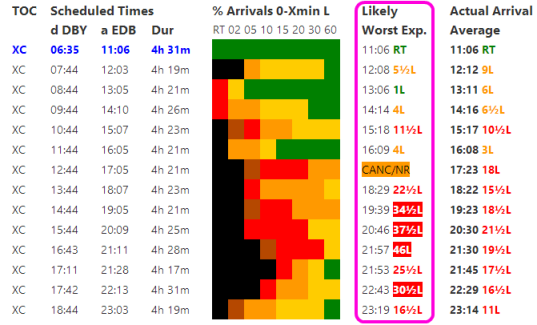
Clearly, travelling earlier in the day on this route is better.
Show me a graph of actual arrival times over time
Choose the quick option "Show Arrival Graph" or the "Show a graph of actual arrival times" setting:
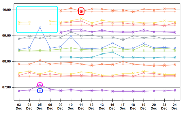
Dots are scheduled arrival times e.g. the dot circled in dark blue above is the scheduled 06:52 arrival on the 5th December.
Crosses are actual arrival times e.g. the cross circled in pink is the corresponding actual arrival at 07:06 on the 5th December.
Cancellations are marked by red 'c' icons e.g. the 09:56 arrival on 11th December, circled in red above, was cancelled.
The area circled in light blue is described on the Help page.
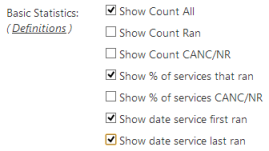
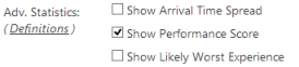
Let me display some additional statistics
Choose the relevant option:
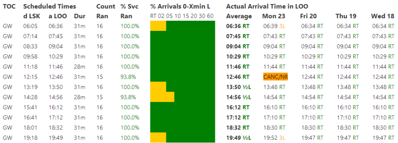
Another Example: The Good: Liskeard to Looe
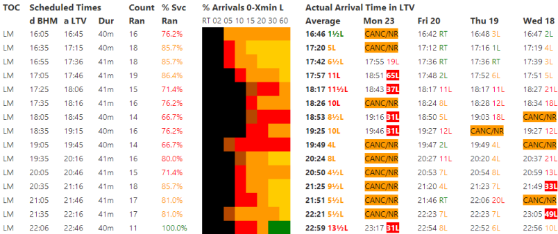
Another Example: The Bad / Ugly: Birmingham New Street to Lichfield Trent Valley